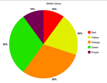
Today In my class we were working on pie charts. But we were doing samples with skittles. We each had ten and it was our sample. The first one down below is the the less accurate one because if the sample is larger then it is more efficient.
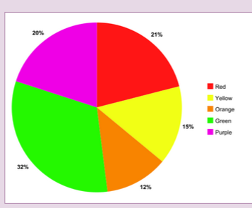
This is the other chart - the class chart where ten people from our class add up how much skittles they had and put it in that color for example the ten people had 32 in total. We would put that in our class sample. Here is the other one.
 RSS Feed
